What is responsive design?
Responsive Design might better be named "Device-Independent Design" or "Flexible-Width Design." It is the term commonly used to describe a web layout that adjusts itself (or "responds") to the available width of the window in which it is being viewed — from small mobile device screens to 4k displays.
Responsive layout is an expected feature of any modern web design, and is perhaps the biggest single factor that makes designing for screens different than designing for print or other media. The good news is that browser default styles are (for the most part) already responsive. That is, an HTML document with no stylesheet will generally display without complaint on any device's browser, and the only user-interaction required to view the content will be vertical scrolling. (Images are a notable exception this statement, but one that is easy to remedy with a simple line of css: img { max-width: 100%; } )
- Create a link stylesheet for this document.
- Add the rule:
img { max-width: 100%; }.
The viewport meta-tag
In the dark, early days of the internet, web-designers paid little attention to designing responsively, and instead built fixed-width layouts for a 'lowest common denominator' screen size, usually 960px wide. That quickly became untenable with the advent of the iPhone, as well as HD and higher-resolution displays. Unfortunately, millions of pages were built with fixed widths before we got wise. Smaller devices need a way to handle these 'legacy' pages, and a way to distinguish them from pages which use responsive layout. Enter the viewport meta tag. This tag is the way we tell the browser that our page uses responsive layout, and should there not apply the browser's default 'pinch and zoom' feature intended for legacy pages.
The tag usually looks like this: meta name="viewport" content="width=device-width, initial-scale=1.0". It belongs in the head of the document, and is critical to proper rendering of your page on a mobile device. From this assignment forward, every page you build should include this tag.
- Add the viewport meta tag to this document, in the head, where indicated.
Testing responsive behavior
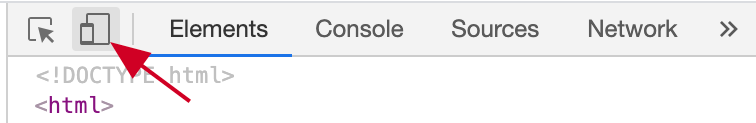
While we can crudely test a page's responsiveness by simply re-sizing the browser window, the Chrome developer tools give us a better way to emulate small devices, as well as test how a page renders at any width. Open the inspector, and find the "Toggle Device Toolbar" button, shown below.
You will likely now see this page re-rendered in a narrow view, controlled by the settings in the toolbar now visible above the page.
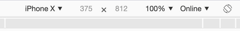
- Toggle the button as noted. Try setting the device-type to iPhone X, or iPad, then try Responsive.
The Responsive device option, rather than simulating a specific device, allows you to test a range of widths/heights by grabbing the drag-handles now found at the right and bottom of the page.
- Drag the resize-handles and watch the page re-flow.
- Experiement with the zoom selector in the menubar. Make sure to end on
100% for zoom.
Manage scale by setting limits, rather than setting widths
One thing you'll have noticed about this page is that text is going all the way to the edge of the page, with insufficient margin. Lines of text are as wide as the window, no matter how wide that is. This is responsive... but hard to read. We should add some left and right margin space. There's also an upper limit beyond which we really don't need (or want) the line-length to grow. When there's excess space available it might be better to just add left/right margin, rather than expand the content area. When width is limited, we want to remove excess margin first, but the content itself will also need to be narrower. We cannot achieve our goal by setting a fixed width for the content. Instead, let's use css properties and proper unit selection to set some limits, rather than fixed sizes.
Let's start by making left and right margins that grow proportionally with the page.
- Create a ruleset for the
body tag.
- Add
margin-left: auto; margin-right: auto;
- Add
width: 90%;
This approach is a little odd, but it's very useful. By using auto for the margin values, we can now trust that the page will center the body element in the available space, no matter big or small it is. Setting the width of the body as a percentage means it will grow as the window width grows, and the space left for margin will grow proportionally. You can use the 'Responsive' device-emulation mode to confirm this.
Now let's set an upper limit for how wide we want the content to grow. This is often dictated by what we consider to be a comfortable line-length for reading a column of text, so it's appropriate in this case to set our upper limit in relation to the base font-size of the document. The rem unit is perfect for this.
- Add
max-width: 40rem; to your body ruleset.
The max-width property overrules the width property when needed, so our page now has an upper width limit of 40rem for content. When the available width is larger, margin: auto; is keeping our content centered. When available width is smaller, our content uses 90% of the available width, leaving 5% on each side for margin.
This example (controlling content width to prevent over-long lines of text) is a common scenario, but the particular approach we used here is just one way to solve the problem. The important thing is the mindset: how do I want this element to grow as the page width grows, and what limits should it have? Managing how things scale and grow, rather than setting fixed values, is critical to responsive design.
Responsive images
The browser does not do a great job handling img elements responsively without some help. By default, it shows images at their actual size. This page already has a style rule applied to prevent img elements from extending beyond their parent containers: img { max-width: 100%; }. In many cases, this is all that's needed to make sure you're images scale appropriately with available width. Having set that rule, you can observe using Chrome's 'responsive' mode that the screenshots above scale down nicely to fit their parent container as we shrink the available width.
Media queries
Setting limits only gets us so far. Most of the time, the single-column layout that works best for a mobile device is not ideally suited for wider screens, and we want to take advantage of the available space to build more complex grids and layouts. Media queries allow us to selectively apply style rules based on the current width of the page.
A simple example
Consider the following style rules:
html { font-size: 12pt; }

  @media (min-width: 640px) {
    html { font-size: 16pt; }
  }
The first line, as we have discussed before, sets the base font-size for the document to be 13pt. The next three lines could be interpreted like this: "When the window width is a minimum of 640px, the base font-size for the document should be 16pt." The media query is just a conditional wrapper around one or more css rulesets. If the condition is met, the rule(s) are applied. Let's add the rules above to this page.
- Add the style rules as written above to your stylesheet.
- Use the inspector responsive emulation mode to view the page at different widths. You should see the base font-size increase when width is above 640px, causing all type to get marginally larger.
Using media queries to modify layout
One of the most frequent needs for a responsive page is manage some content that is stacked vertically for narrow views, but arranged side-by-side for wider views. There are many, many ways to accomplish this, but one of the easiest and most powerful is to use flex layout, like we did for grids.
In the example below, we have a div element with two children, each of which is also a div. I've added a bit of styling so we can see their boundaries easily, but they are behaving like any generic block-level element: They fill the width of their parent container, and their height is controlled by their content.
Let's use flex to made these two containers site side-by-side, but only when there's at lest 640px of available width.
Lorem ipsum dolor sit amet, consectetur adipiscing elit. Proin non nisi porttitor, finibus magna in, pharetra magna. Nunc a convallis ante. Vivamus aliquam rhoncus diam, eget elementum nisi faucibus ultricies.
Donec quis arcu pharetra, imperdiet felis et, consequat ligula. Maecenas et sem lorem. Nullam in venenatis nulla, in gravida justo. Sed sollicitudin mi sit amet scelerisque facilisis. Maecenas vulputate mattis urna vel mollis. Vestibulum non gravida urna.
- Create a media query, with condition
(min-width: 640px).
- Inside the query's curly-braces, create a css selector for
.two-columns-example.
- Set
display: flex; on .two-columns-example.
- Add another selector for
.two-columns-example > *. This should live inside the same media query. Its job is to select both children of .two-columns-example.
- For the children, set
width: 50%;
You should now be able to use Chrome 'responsive' mode to watch the behavior of this element change at our 640px break-point: i.e.: the width at which we've decided this element should change its visual behavior.
Guidelines for using media queries
Media Queries do not replace your default styles, they add to them. DO NOT define all your styles for one width, then use a media query to "start over again" for a different width. That's a recipe for confusion and massive repetition in your stylesheet. Instead, start with the rules that apply everywhere, and then add media queries ONLY to selectively provide additional rules for the elements that need them. I find it easiest to keep my media queries close to the primary elements they modify in my stylesheet. "Here are the styles for element X, immediately followed by a couple additional styles that apply to the same element at large widths."
For various reasons, many designers find it easiest to take a mobile-first approach to building responsive pages. That is, style the page for mobile, then 'grow' the width of the browser a bit, see what starts to have problems visually, and create media queries to address those problems, until you've reached a full-width layout. This approach usually uses @media (min-width) conditions, i.e. "When the window is at least this wide, apply these additional styles." Other designers prefer desktop-first approach, where you build the full complexity of the page first, then use @media (max-width) conditions to selectively simplify things as the page-width decreases. Read max-width as "When the page is no larger than this wide, apply these rules." I prefer the first approach personally, but either works. However, avoid doing both at the same time — this is often a recipe for confusion and frustration!